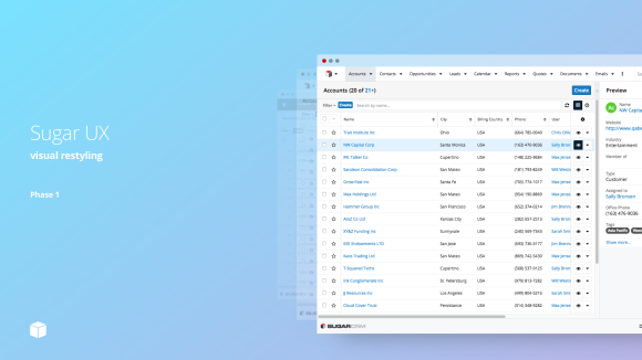
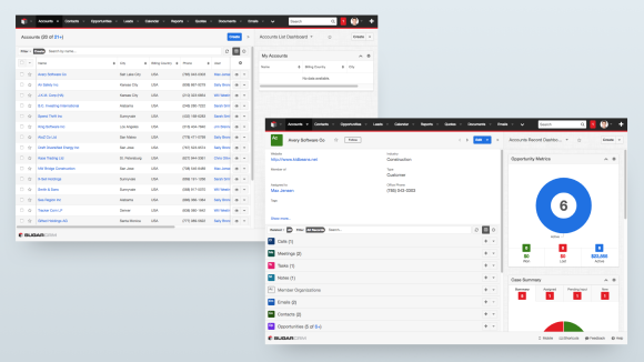
SugarCRM is on a mission to empower our users to delight their customers. To that end, we are pleased to introduce the first phase of visual restyling, and give some tips on how to work with the new UX.

The SugarCRM User Experience team (led by Brian Ng) launched a rigorous heuristic evaluation of the web and mobile Sugar products. Issues were identified as we evaluated key use cases and new solutions were documented. This thorough understanding of the product, customers, and the industry has helped us identify which issues to address first.

Dark gray text on light gray background led to poor legibility. Heavy blacks and gray linen added to the dated look and feel.

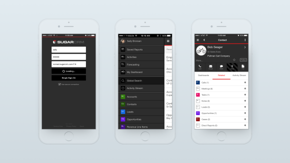
Sugar Mobile had a dark and drab visual design. Buttons for key actions were positioned differently on key screens. [more]
